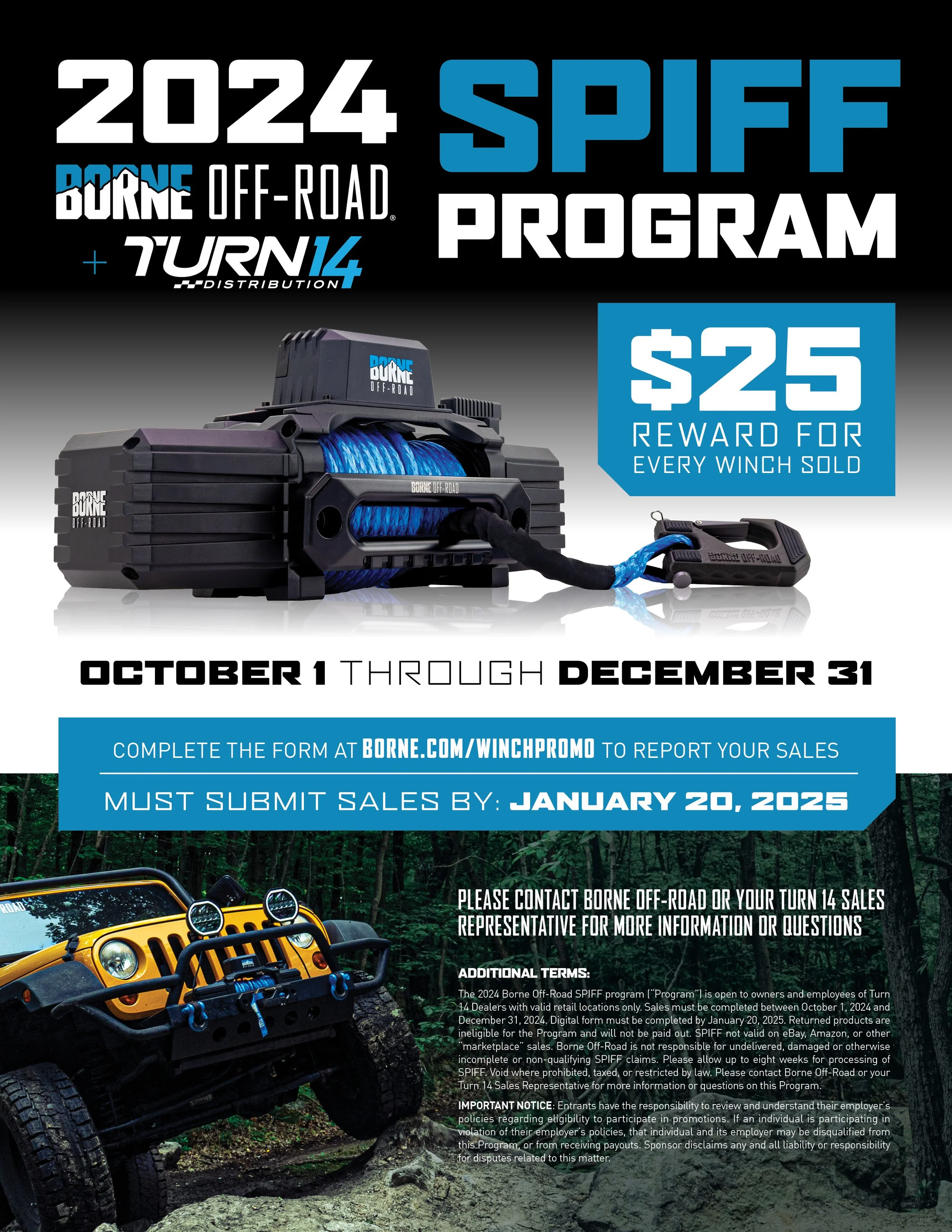
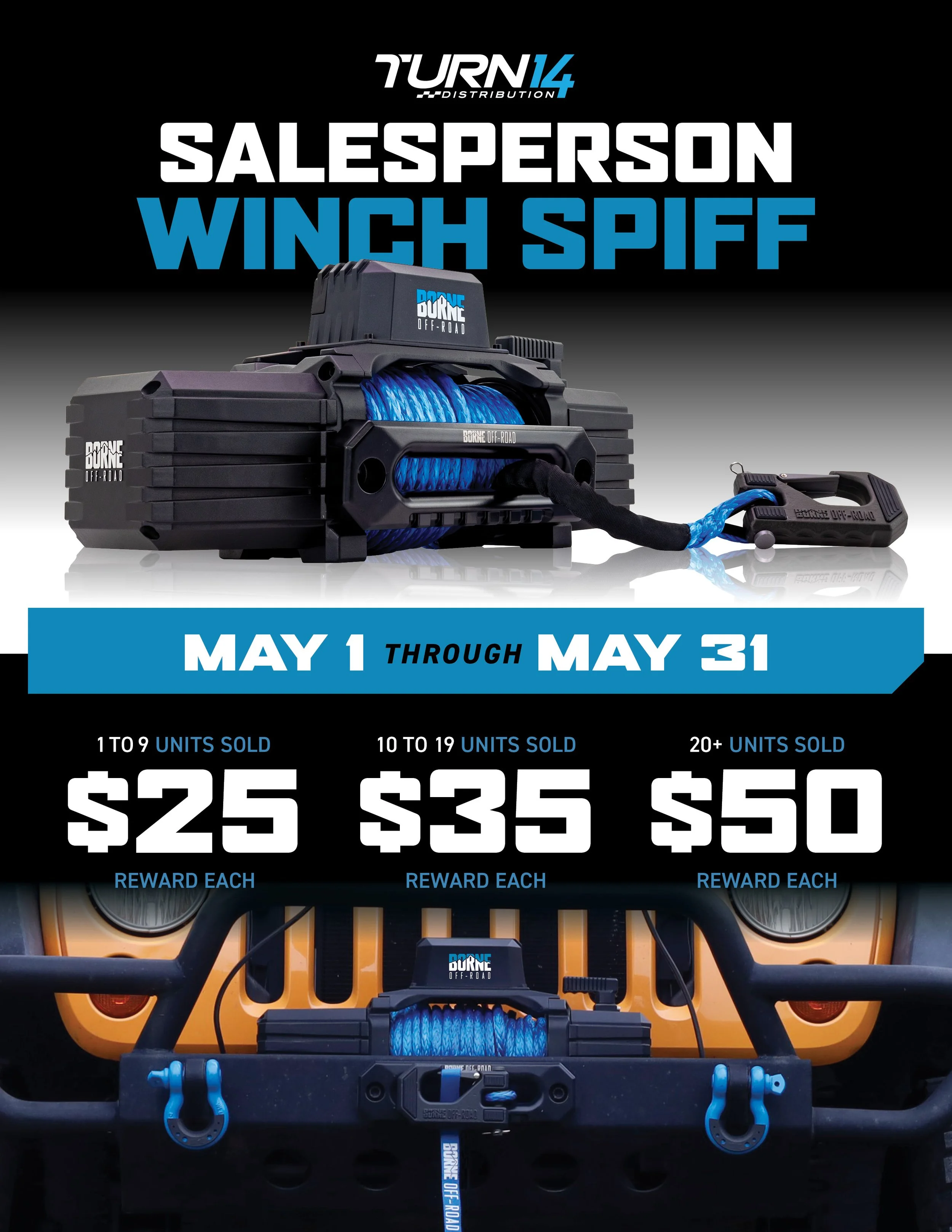
Borne Off-Road + Turn14 Winch SPIFFs
The Incentive: This wasn’t a complex promotion. It was a direct cash-for-performance play. I took the requirements and boiled them down to two primary concepts: Sell the winch, get paid. For the Q4 program, it was a simple $25 per unit. For the May program, we designed a tiered system. The more they sold, the higher the reward. The goal was consistent: make the reward worth it.
The Audience: The focus was entirely B2B. These sheets were for the Turn14 distribution network. The message had to pierce through the noise of a busy distribution company. The information had to be seen instantaneously.
The Design Language: We ditched the rugged feel and kept it clean and corporate. This isn’t a consumer ad. This is a business document. I used studio photography that I specifically captured for this purpose. I took extra, high-key shots of the winch with its distinctive blue line to use in this style of asset. The design prioritizes technical clarity over atmosphere.
The Clarity: SPIFF data can get messy. How it works must be bulletproof. I used clear, bold headers and large elements to get them to pop the loudest. The date ranges are prominent. The registration information is simple and actionable. That is what makes an incentive like this work.
The Hero Element: The product and the money are equally weighted, but the product popped more in the final design. The high-key studio shot of the winch is the anchor. It immediately establishes that this is a professional, high-performance product. By integrating the cash values right next to the high-detail asset, we visually linked the product to the paycheck.
The Reality Check: I didn't track the final sales data for this campaign. As the designer, my metric was to make this as clear as possible. The sales team could take these assets to any distributor with absolute confidence. The program details are unmistakable. The assets are clean and professional. The tools are complete. The job of these sheets was to remove any confusion.